Land Rover Experience Drives
UI/UX | Web design | Interaction design and Art direction
To redesign the existing Land Rover Experience Drives section to improve the overall look and feel of the digital and ecommerce experience and inspire the audience with enticing imagery.
This entailed reordering the content to be more concise throughout and redesigning the forms to ensure a seamless customer journey from landing page to purchase.
Team: Ben Marshall Snr UX Designer

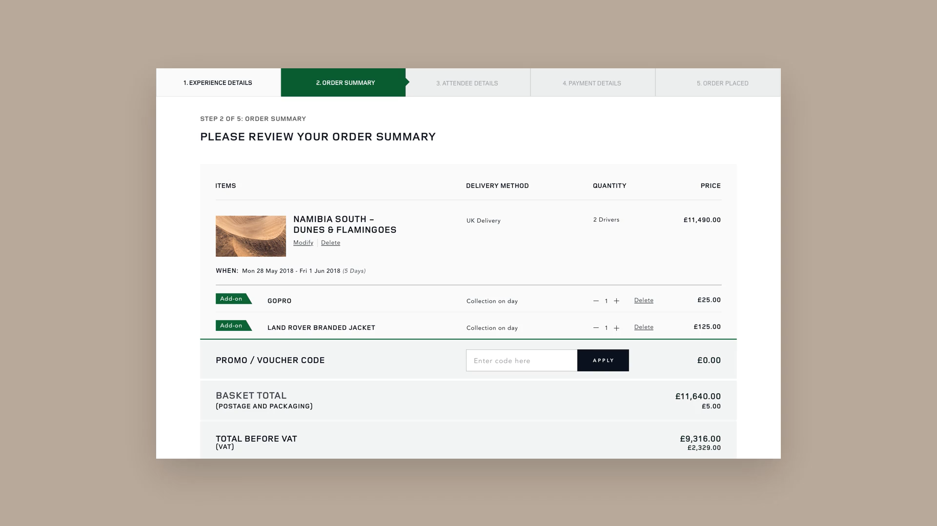
Re-designed pages of the desktop Adventure Travel payment process

Working prototype of Step 1 of payment process

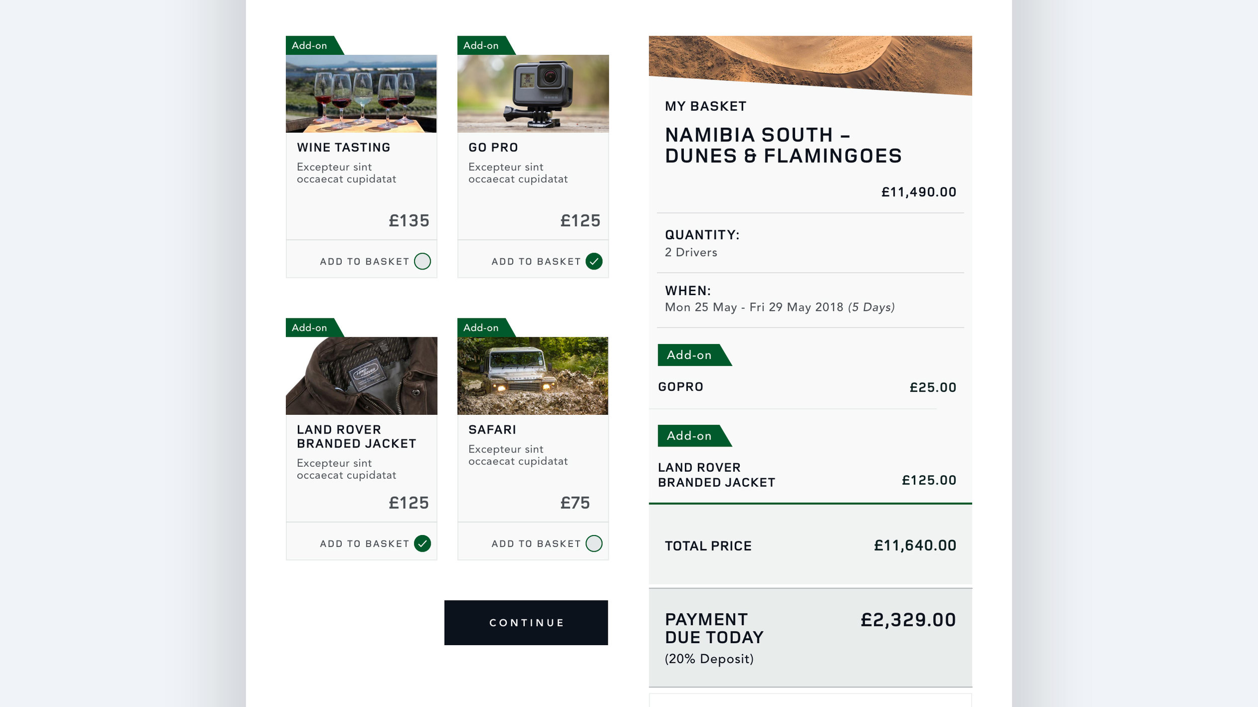
Add-on design which dynamically populate My Basket when clicked

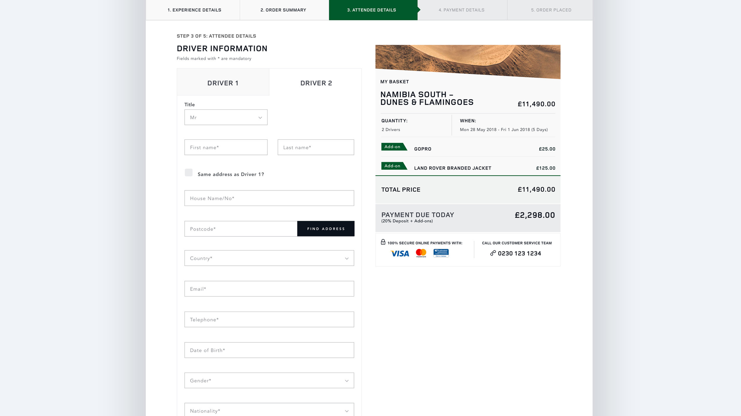
Drive 2 tab dynamically loads after user has input Driver 1's details

Step 2-3 of payment process - form field input

Collapsible/expandable Basket on mobile

Responsive screens of the payment process - My Basket anchors to the bottom of the screen and expands to reveal the contents of the basket

Manufacturing Tour pages at various stages of the payment process

Image rich and enticing landing pages - give an overview of the experience and tour itinerary
